Branding & Visual Identity
ALO Financial Planning
- Role:
- Wordmark / Visual identity
I explored a quieter visual direction for ALO Financial Planning. The finished wordmark pairs the original lettering with a resolved circular O on a clear cyan field, and the identity is worked two ways: one ending where the candlestick growth chart fades away, one where it stays behind the mark.
Two endings, one idea: in version A the chart fades and the wordmark holds the frame alone, while in version B the chart stays — a quiet, permanent signal of growth behind ALO. Watching them side by side shows exactly how the same identity can be scoped, completed, and presented, so the choice is a design decision you can see rather than imagine.
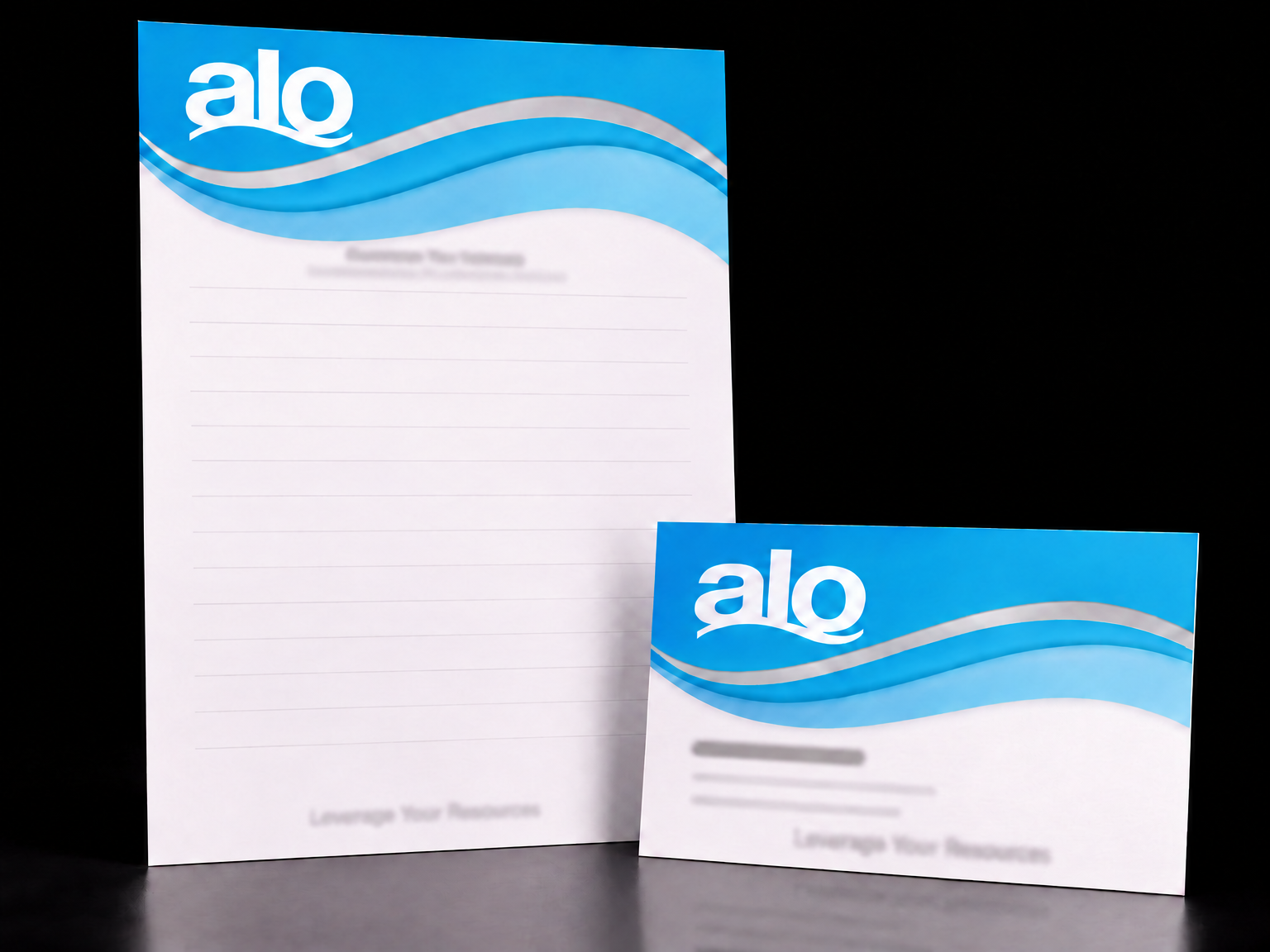
The swirl carries the identity onto paper
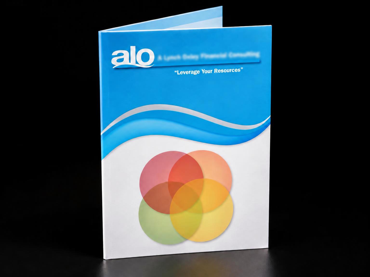
I designed the brochure for A Lynch Oxley Financial Consulting, then carried the same blue-and-silver swirl across the letterhead and business card, bleeding off every edge, so every piece reads as one family. She chose it, loved it, and has used it ever since.